Problem
Kimchi is a crowded shelf, and almost all of it looks the same. Studying the competition — Seoul, Jongga, Mama O's, and the rest — I kept seeing one playbook: green-and-red palettes pulled from cabbage and chili, family-recipe stories, heritage cues. I wanted a kimchi brand that stood out on design, for people who already love bold, funky, fermented flavor and are up for something new.
Process
The opening was obvious once I saw it. Everyone was selling heritage. Nobody was selling the part that actually makes kimchi interesting: the fermentation itself, the bubbling, the layering, the time. That became the concept.
Naming followed. A mind map of flavor and process kept circling back to patience, and "With Time" won, the best kimchi can't be rushed. I developed two directions, one playful and illustrative, the other bold and a little acidic, and pushed the bolder one.
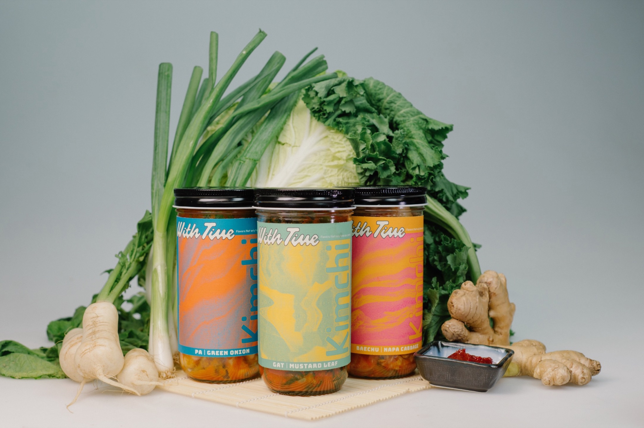
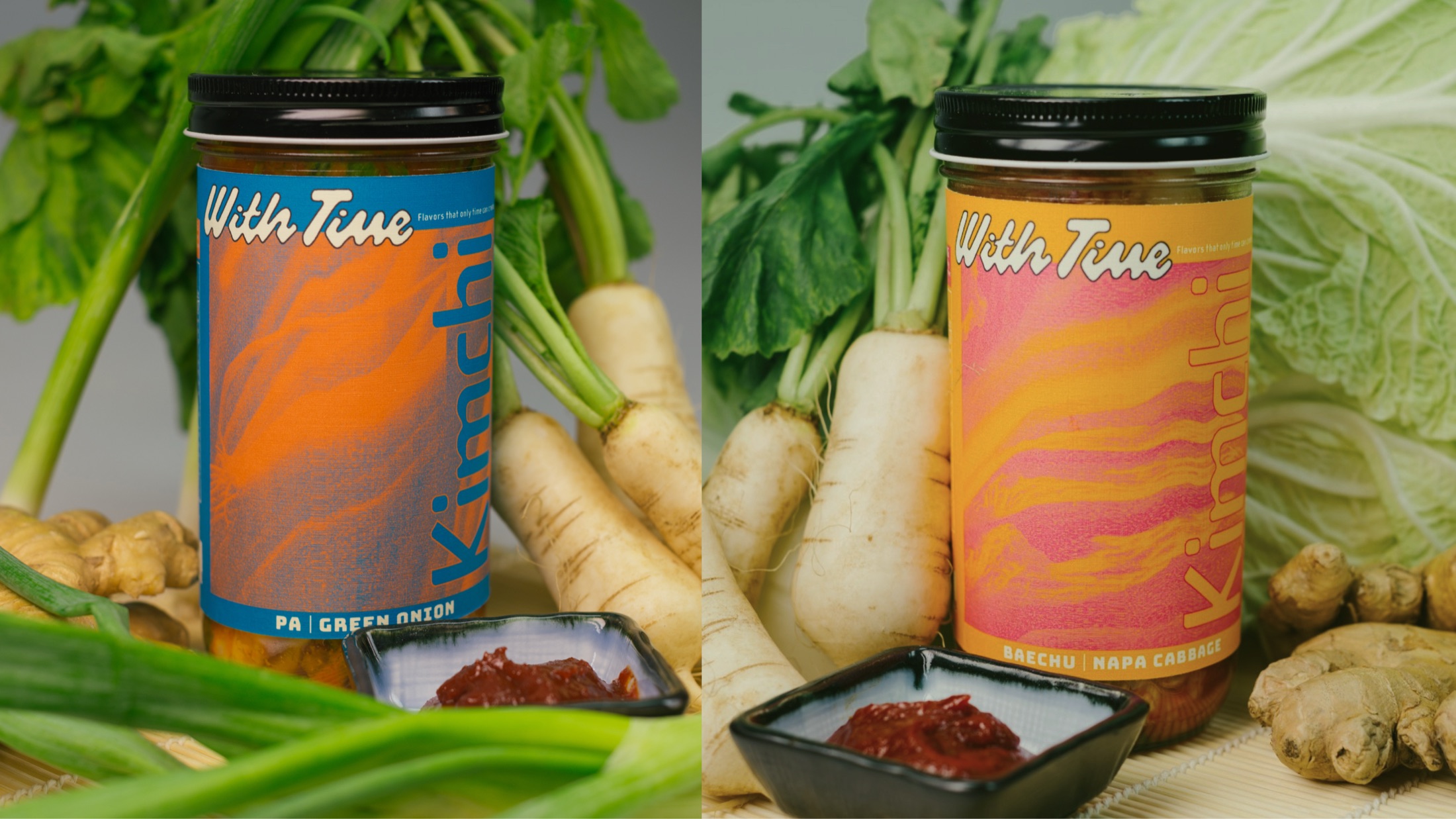
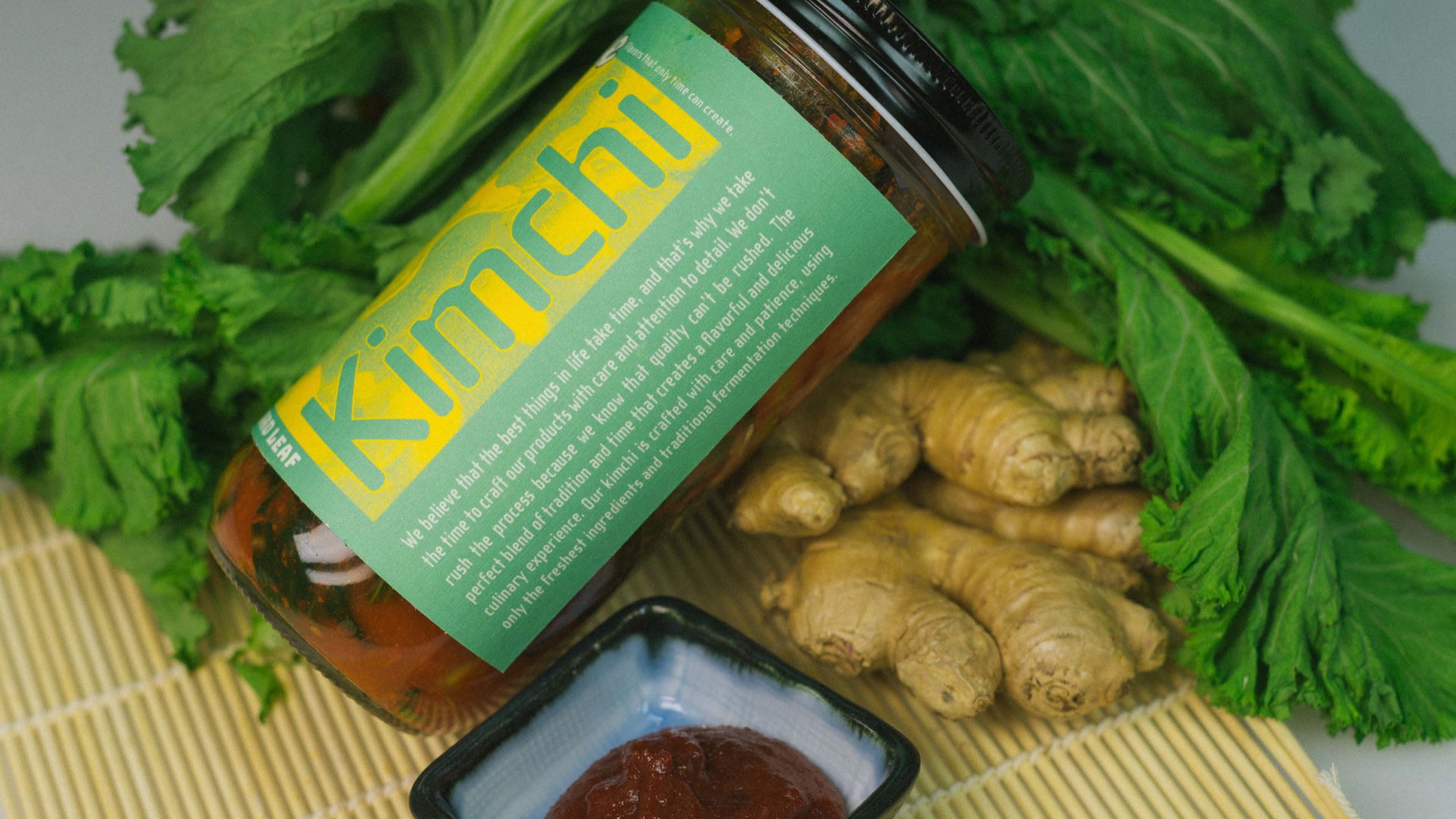
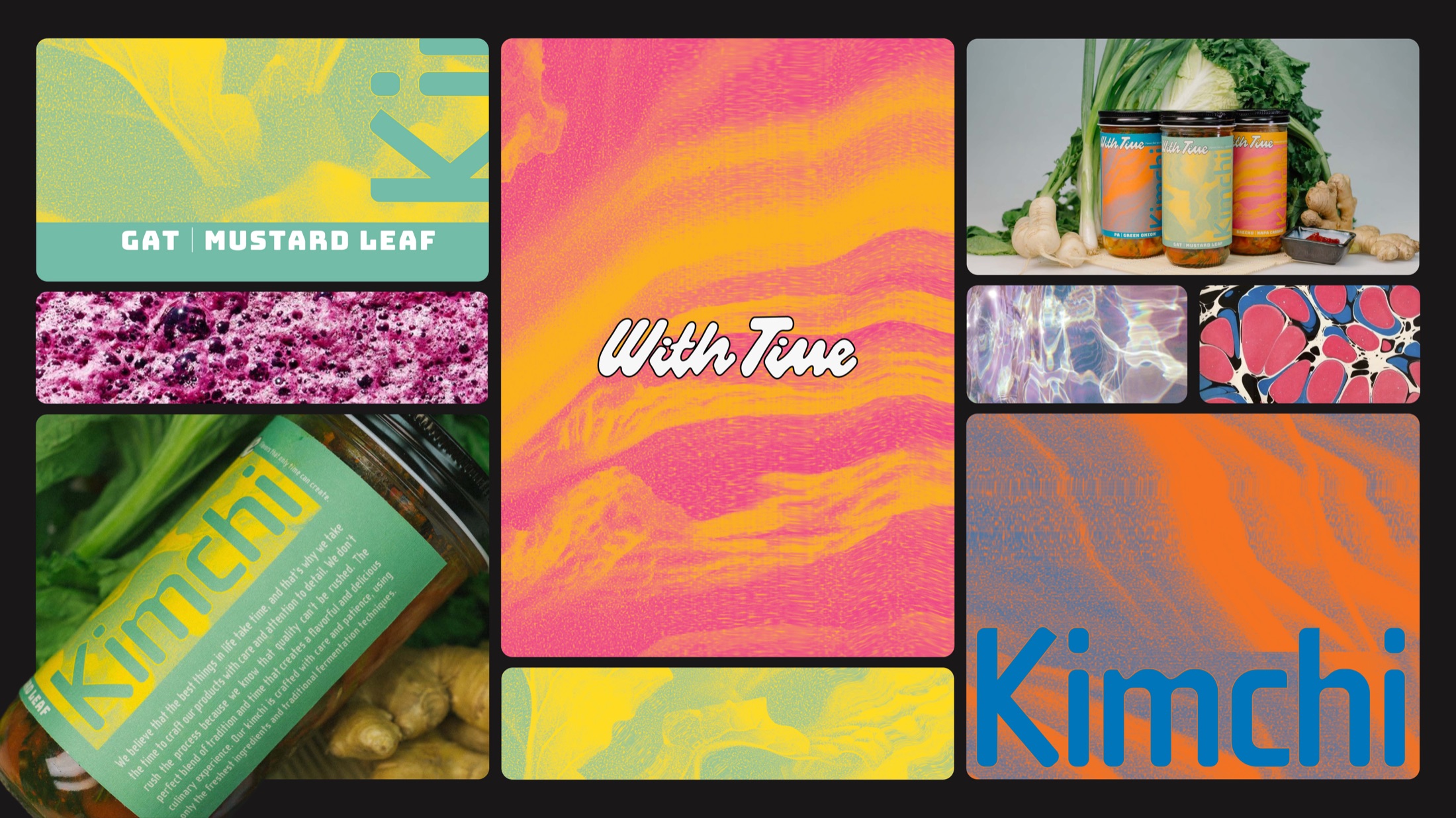
The wordmark is hand-lettered to keep the made-by-hand feel. The palette is loud and high-contrast, and each of the three varieties gets its own color while staying one family. I ran the vegetables through a pointillize-and-scan treatment so the labels feel textured and slightly strange, like something mid-ferment.
Outcome
The result is a three-flavor line that reads more like a natural-wine shelf than a grocery aisle, and stands out exactly where its competitors blur together. The takeaway: the strongest way to stand apart wasn't louder graphics, it was a different idea, and once the brand was about fermentation, every other choice had something to push against.